Recharge is a a product that allows users to buy last minute gift cards anytime from anywhere in the world.
2023
![hero image]()
The company. Recharge started as an experiment. The two founders discovered a new niche that could be transformed with the power of the internet.
For the first recharge orders, they bought a ton of physical gift cards and manually scratched and sold the codes online to check the grounds.
It turned out successful so they started building the recharge.com marketplace.
My role. I was hired as the designer for the growth team but my prior experience with native apps proved like an even more useful asset for the company.
I am responsible for all the features inside the recharge apps. I help with the quarter planning and i also do the user interviews for the apps.
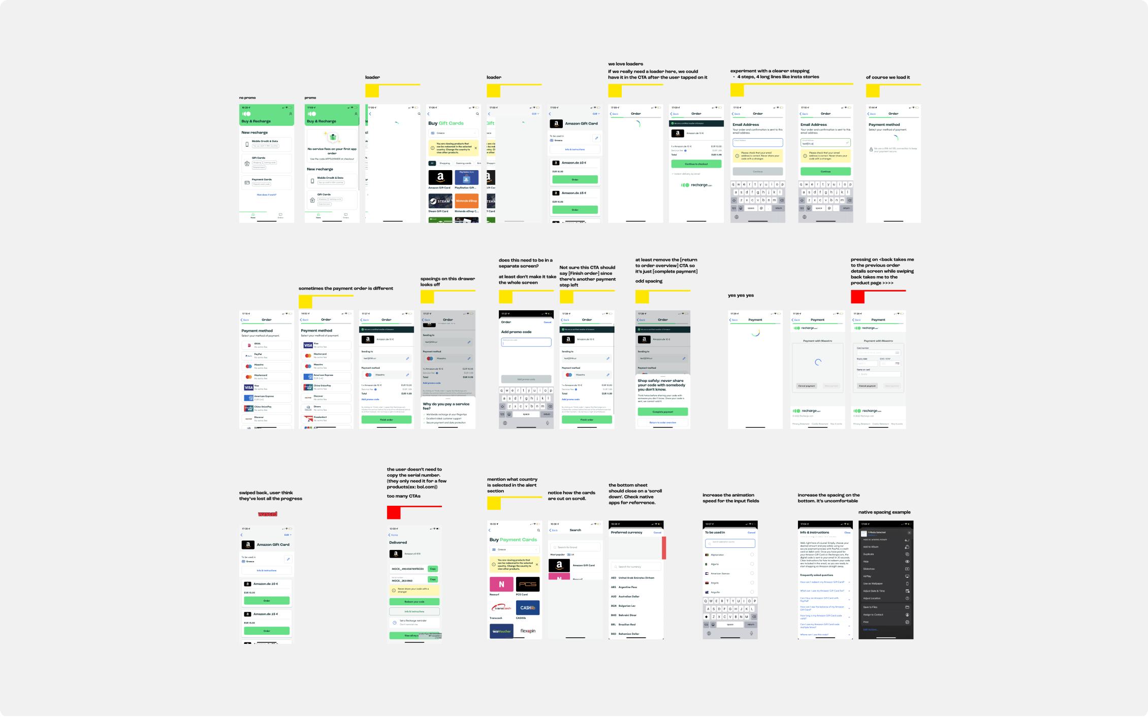
![audit screenshots]()
This is just the gift cards buying flow
First things first - Audit
The first thing i did after joining the apps team was doing a complete audit of the main user journeys inside the app.
I’ve noted all the things that would need to be tackled and color-coded them by urgency.
For the things i wouldn’t understand, i would bombard my PO and developers with questions.
After gaining a better understanding, i’ve created an action plan on the urgent things and started working.
After the audit and the initial plan, we started looking into the data we’re gathering and what improvements can be made further.
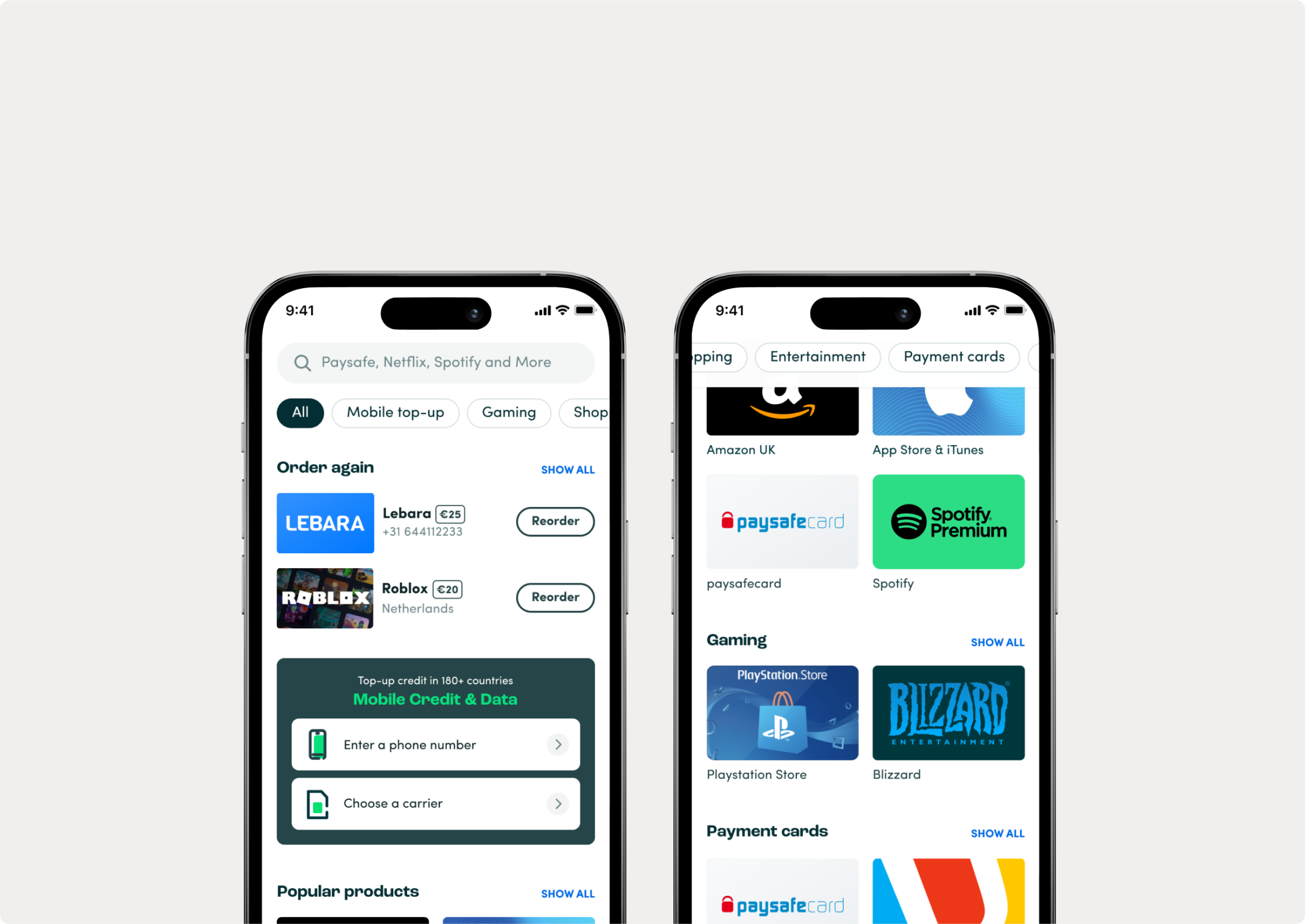
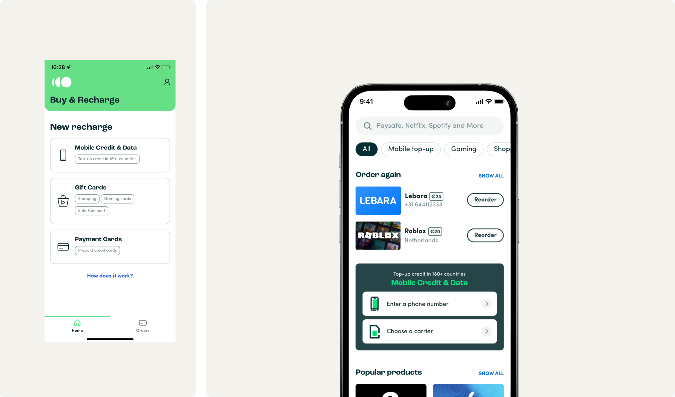
![homescreen screenshots]()
Old homescreen version
New homescreen version
Changing the user behaviour
Analyzing the data, we noticed that most users buy just one type of product inside the app.
They would do an order and then just easily reorder the same thing when needed without ever browsing through the other products we had.
Experimenting with a new homescreen where we exposed the subcategories showed some interesting insights.
We did an a/b test with 30% of our app users and it proved that indeed, returning users started browsing and buying different types of products.
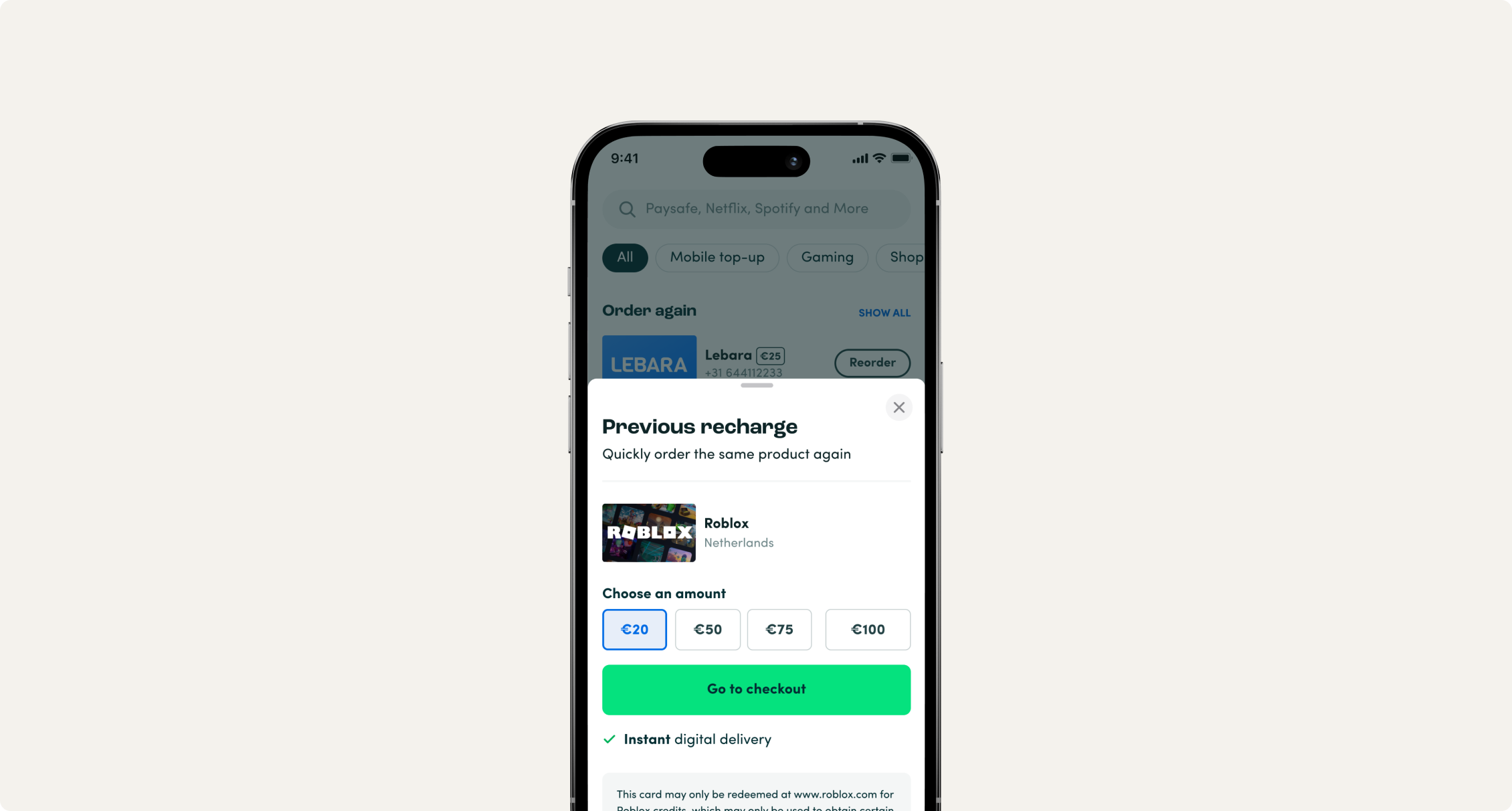
![reorder screenshots]()
Boosting in-app user spending
While checking the data on the re-order feature, i’ve noticed that about 32% of the users would change the value of their order. That required them opening the product page from the reorder page and choosing a different value.
I saw a hanging fruit there and proposed we expose the product values right away on the re-order page while pre-selecting the option the users previously bought.
This has proven to be a good move and the users started buying higher card values.
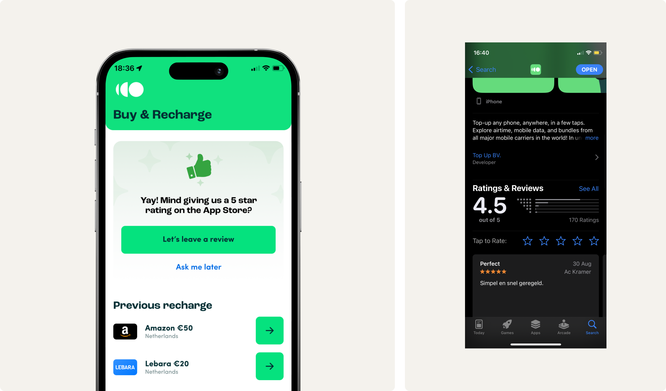
![app store ratings screenshots]()
Increasing the app reviews to increase the trustworthiness of the app
The app store and play store reviews increased averaging 4.4 stars from lower than 3.8 stars average.
![app store ratings screenshots]()
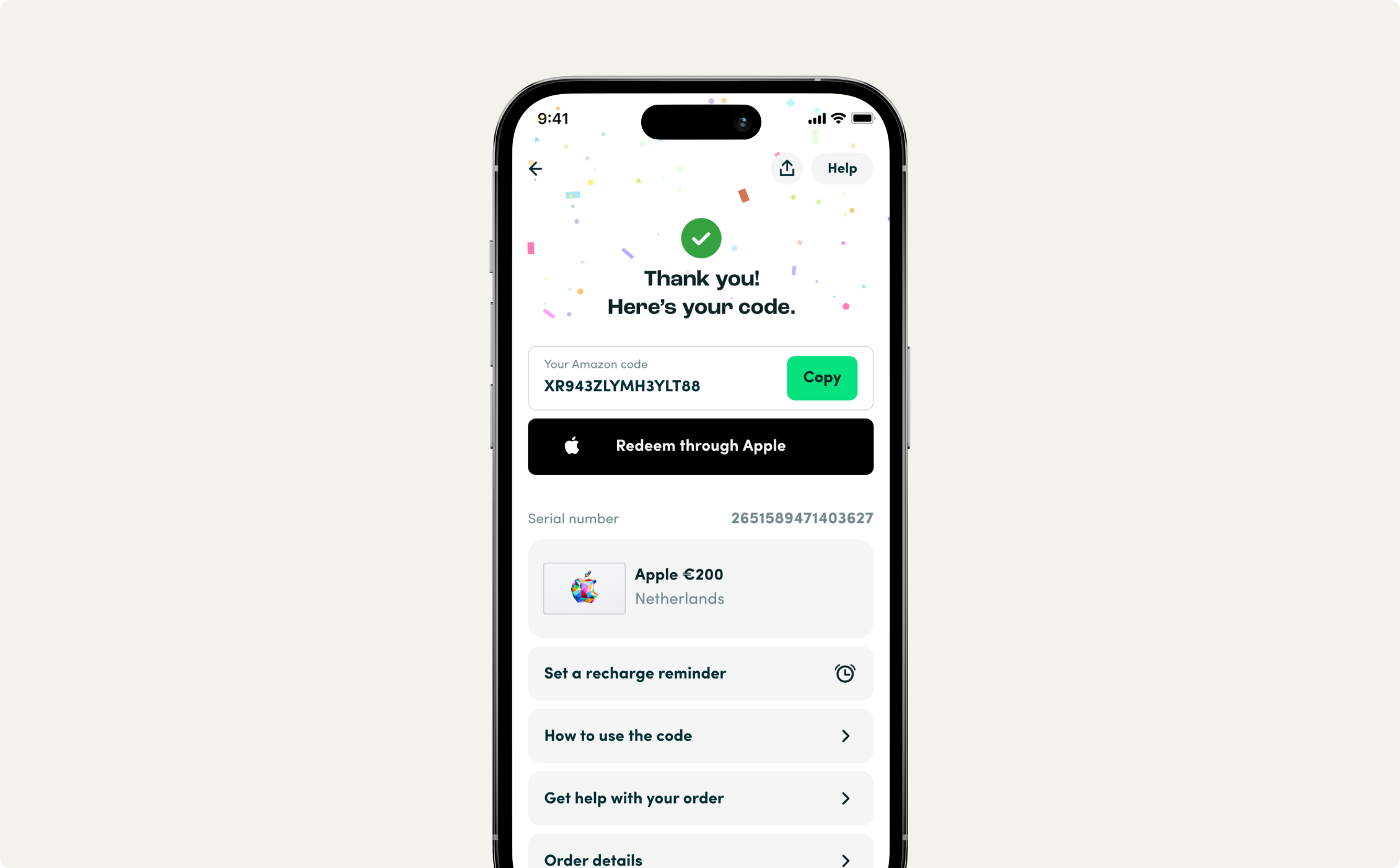
Thank you screen - from boring utilitarism to a fun experience
This is an example of something that cannot be proven with data that it converts better because it’s the screen after the user is converted.
So its influence is more on the feelings side rather than orders and revenue.
Also making the waiting time shorter by loading the screen in a stepped way.
![app store ratings screenshots]()
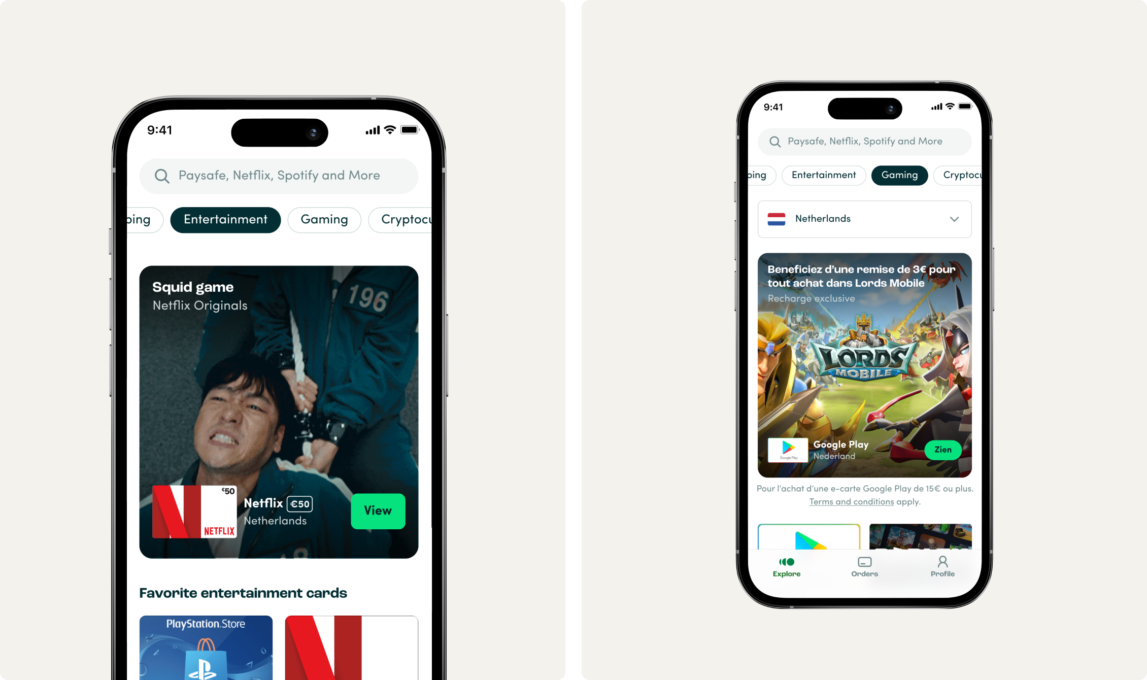
Adding new marketing channels inside the app for better promotions
And increasing the visibility of some categories we want to focus on as a company